Graphic Design. Visualization . Typography
Adobe Creative Suite
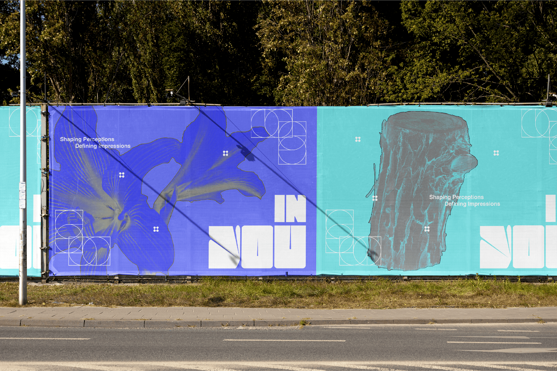
Impression transfers virtual objects onto surfaces, much like labels imprinted on the mind, defined by what we feel in the moment. Often, we impose our judgments or allow external definitions to shape our perceptions. However, meanings cannot be forced but can be open to interpretation, visualizing each impression uniquely. We are not bound by standardized labels; instead, we design the outcome and leave the process open for individual definition.
.jpg)
.jpg)
.jpg)
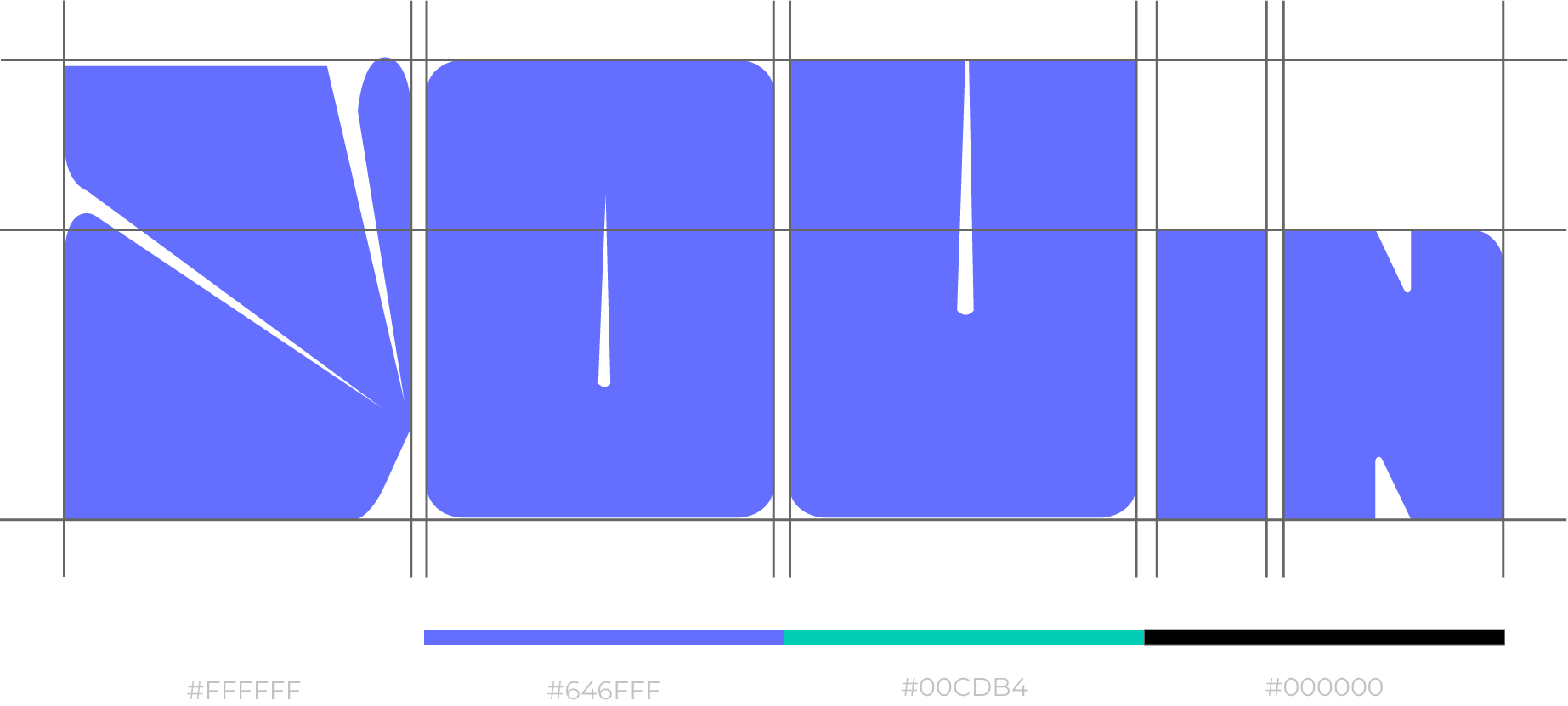
The concept for the logo, as shown in the image, visually interprets the abstract notion of impressions being transferred onto various surfaces, much like labels that leave a lasting mark on our minds. The logo uses bold, striking letters to suggest strength and individuality, while the color scheme blends shades of blue and white to evoke a sense of clarity, creativity, and fluidity. The dynamic curves and sharp lines represent the malleability of perceptions, echoing the way external definitions can shift based on context or interpretation. The design elements, such as gradients and precise alignment, visually reinforce the idea of impressions being fluid and flexible, open to interpretation rather than fixed labels.
This studio logo conveys a modern and dynamic identity, characterized by its structured, diagonal lines that symbolize movement and innovation. This logo effectively encapsulates the studio’s ethos of pushing boundaries and evolving while staying rooted in structure and expertise.